Isabel Hudson is an award-winning set and costume designer and a NIDA alumna. Isabel won both the 2019 and 2018 Sydney Theatre Award, Best Stage Design of an Independent Production for her work on American Psycho the Musical and Cry-Baby at Hayes Theatre Co. Her designs include Farnace directed by Mark Gaal at Pinchgut Opera, Winyanboga Yurringa directed by Anthea Williams and Every Brilliant Thing directed by Kate Champion at Belvoir Theatre. Earlier this year Isabel designed the set for Torch The Place for Melbourne Theatre Company. Interview by Laura Anna Lucas.
How did you first get involved in theatre and design?
In my first experiences of theatre, I remember loving the moment of delight when I walked into the theatre and saw the set. The pure joy in seeing an entirely new world or sitting in the dark trying to imagine how the players were going to create the play or the surprise transformation the set would take, really inspired me and sparked my imagination. So I think my romance with theatre and design was really sparked in those moments.
American Psycho/Design:
What was your design concept for this theatre adaptation of the film American Psycho?
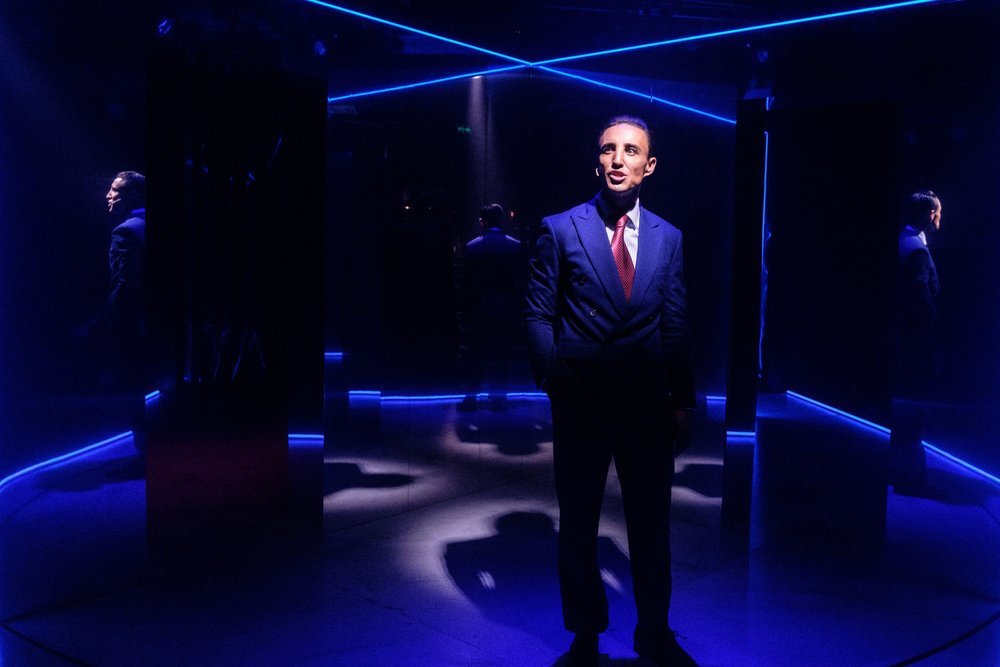
One of the driving forces of the show was the concept of the ‘façade’. We wanted to set up a theatrical world with clear rules and then start to chip away at that structure and make the audience question what is real and what is fake. We always knew there was a kinetic energy to the piece and that we wanted to create a world that somehow tapped into the narcissism, arrogance and privilege of the character of Patrick Bateman. The Director (Alex Berlage) and Costume Designer (James Mason Browne) work together often and work very collaboratively, and when we work together we often try to take the work and slightly warp it – to create a queer perspective. This underpins a lot of our design choices. Combine all this with the inherent meta-theatricality of the piece that we wanted to crank up 1000%. This led the director and myself to investigate the idea of a mirror, and a never-ending mirror maze on a revolve. We wanted the audience to go on a wild ride of images, similar to that of those flipbook animations. The revolve would turn, and a new horrific image would be presented again and again.
What was your design process of transforming a film into a stage production?
Initially, the process was about creating our own image of the show and taping into the very thing that makes it a theatrical experience rather than a filmic experience – which is the live audience and live performance. We wanted to concentrate on creating a journey that the audience would feel viscerally, which is something that a small space like the Hayes Theatre really lends itself to. This was the driving force for the mirrors and use of blood in the show, and also the breaking of the fourth wall when Patrick Bateman steps off the revolve for the only time at the end of the show as we question whether the whole narrative of the night was real or fake. We also debated long and hard about certain images that are part of our collective memory of the film and how to use these within the narrative we were trying to tell. We ended up only using one, Patrick Batemen in the raincoat with the axe, which we felt was an iconic scene in the movie and wanted to give that visual satisfaction of recognition to the audience. We wanted to create our own unique theatrical experience, not an adaptation or recreation of the film on stage.
How did you navigate your process to meet the logistical parameters of independent theatre and still maintain the creative vision and design sensibility?
Independent theatre is always a slog and feels like sprinting up a hill in red patent leather stiletto heels; you know your ankle is going to get broken. As a designer, you are constantly trying to juggle the aesthetic, the concept and money. You have to take a huge load on as the designer, and if the project isn’t rewarding or the collaborators aren’t supportive, you are truly stuffed. On this project, this design would not have been possible without the support of the incredible producers and creative team. My two producers (Bradley Barrack & Spencer Bignell) were integral. They both went above and beyond, Brad driving to Melbourne in a truck to pick up the revolve and Spencer helping me hand-make a kabuki system in the foyer of the Hayes. To say that independent theatre is hands-on experience is an understatement. Without these two, this ambitious design would have been impossible. So in terms of negotiating the creative vision, it felt achievable because the collaboration was strong, and support was provided for when asked. This also meant I included these people in the design process from the beginning, so it became more about the whole team striving for the design, which was imbedded in the concept of putting this show on in the first place. So for example everyone was hustling to find a revolve, which we ended up hiring and buying from Chunky Move in Melbourne.
What was your experience working with the director and lighting designer? How was the lighting incorporated into the set?
With a set made of a white marble floor and mirror walls, on a revolve, the lighting was integral to the success of the design. In this collaboration, the lighting designer was also the director, and the set was born out of a real collaboration with all the creatives. It felt a very integrated process. The mirror for the show had to be lit in a very particular way, and we incorporated the neon extrusion across the whole structure to pulse with the heavy base orientated music tracks. Although the music wasn’t live, Andrew Warboys’ arrangements were truly amazing and influenced the design heavily. I remember starting the design and hearing this pulsating club-like music and knew the space had to match this atmosphere. The director, costume designer, choreographer and myself also talked a lot about the representation of violence and specifically in this text the violence towards women. We wanted all the violence to be suggestive and abstracted, which lead to some really interesting imagery of the mannequin-like cast covered in sheets of blood strewn plastic. All these ideas were thrown around amongst all of us, and so the set, the costumes, the images, the choreography, the lighting and sound all felt part of eachother.
MTC/Industry/Torch the Place:
What was your experience working for a state theatre company, how does that differ from other companies?
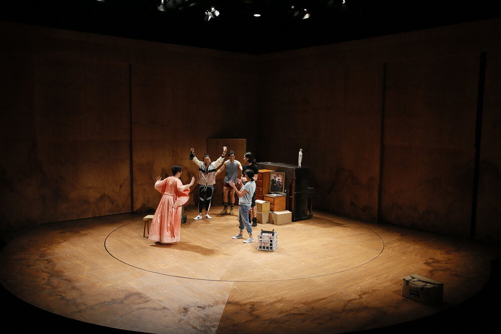
The main difference is in the team, money and resources you have supporting you. It makes it exponentially easier to focus on the design and story-telling rather than the how am I going to achieve this, a question which is screaming through your head whenever you design for independent theatre. It changes the process in many ways. With the MTC, I worked for a long time with both the director and company on versions of the design. I flew down for the workshop of the show and developed the design concept through that process while the writer was present. Then half-way through the design process, the show was selling out so the design also became about how could we tour the show, which radically changed the design. But all of this process did lead to a fuller concept for the show. We also had the luxury of having the revolve in the rehearsal room. The design had so many elements on stage that the actors interacted with, as well as the revolve itself, so having it in the rehearsals allowed the design to actually work.
This type of process is kind of unique to state or funded theatre companies. An independent theatre company would have ruled out this design concept.
What was it like working interstate? Were there any challenges?
I found it a pretty smooth process. I guess the main challenge was not having the physical immediacy of my collaborators, to pop over for a cup of tea and look at the model or the drawing I had done. Instead I had to share all that information via the computer, taking videos and such, which takes a massive amount of time. But I found this to be an excellent editing process for myself. It made me stop and really look at what I was creating and analyse the visual.
Were there any surprises or unexpected things that came from this production creatively?
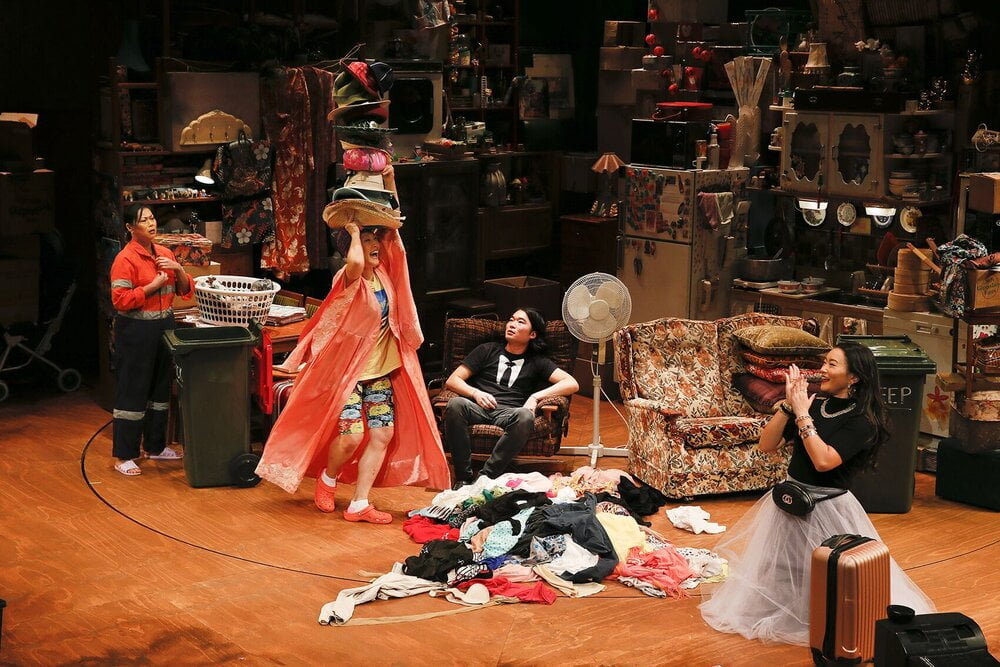
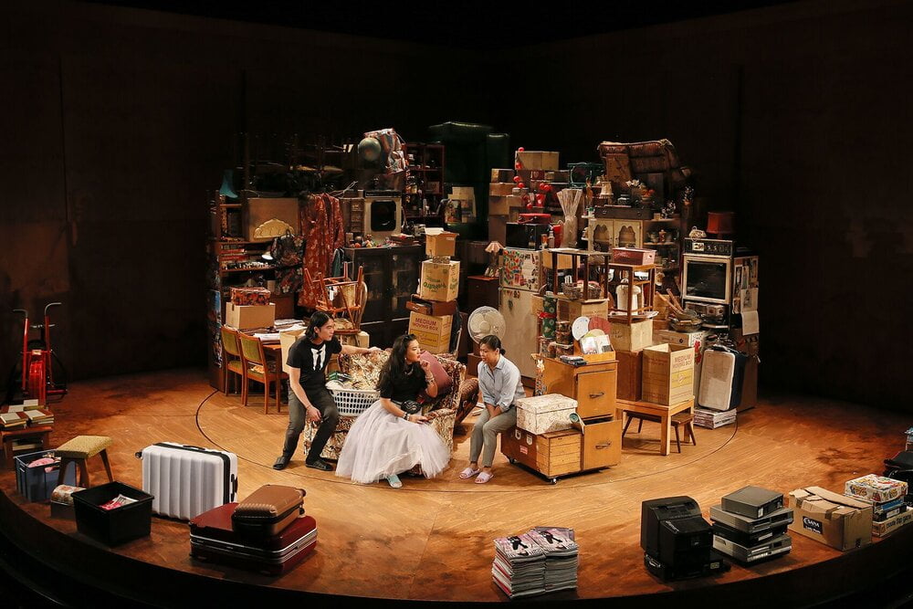
This particular production centred around a character who hoards. So the design was a reflection of the overwhelming feeling that too many piles of stuff and mess created. So I have been hoarding model furniture for a very long time and used this collection with some additions to create the adhoc, eccentric sculpture pile of junk that ended up on stage. The weird correlation of the story and hoarding pieces that have their own narrative was very satisfying for me.
Was there something you learned about your design process or about your work that you’d like to take with you on future designs/productions?
This experience really reaffirmed a few things in my process. I love making models and think they are the best design and communication tool. I modelled many design variations for this show and this was how I was able to sculpt the design. I think it’s a great way to configure space. I also loved being in the workshop and working out the practicalities of the build. I also drew a lot while the cast read the script and while sharing my ideas with whole cast, director and writer and this sparked some really great ideas.
Freelancing:
What is it like for you being a freelancer? What are the challenges and also the benefits of working as a freelance designer?
I love the flexibility of being a freelancer and that I control my work and mostly control my own time and schedule. I love that I am not bound to a desk and can work at the library or go to a matinee or art gallery in the middle of the week. It also means I can explore different parts of theatre, and visual arts easily and try to streamline the work I do. I also teach at NIDA and I have always loved the ability to participate and contribute to the industry, while also being inspired by the talented teaching staff and students.
But the challenges of being freelance are enormous, exacerbated by the strain put on the Arts by Covid19. Working out your own schedule, living between the strange hours day and night, never fitting into the right funding box, finding a workplace that isn’t your bed, doing your tax, while also doing everything on your own are all huge challenges. It has taken me a long time to set up my workspace/life and to think of myself as a legitimate business and artist. I have a studio where I work in Surry Hills, and I found this a significant change in my working life. However, there are a whole new set of challenges that have presented themselves during this time: contracts changing fast or being cancelled, companies not paying certain fees, shows being cancelled. But I do think there is a huge advantage in being a freelancer, the self-motivation and creativity that you cultivate as a freelance artist are survival tools for social distancing and isolation.
How has having an agent affected your work and practice as a designer?
It has had a very positive impact on my work. It has given me the freedom to just concentrate on doing the work. I feel it has also made me feel a lot more protected and secure and to have someone fighting in my corner -especially when being a designer can be very isolating, and during this time of Covid where there have been so many quick changes to contracts. I also think it’s a great source of collaboration in terms of finding new work and connections.


