
Tim Ferrier, production designer, talks to the APDG about working on a brand new television series, Reckoning.
As the production designer, how did you find your way into the world of this series?
Reckoning is a contemporary drama set in a fictitious town in California. It is a show set in a seemingly happy, prosperous community town. The two main families live respectable middle class lives, in picture perfect suburbs. Once the surface is split though, there are a number of festering elements to both the families and their backstories, which come to light.
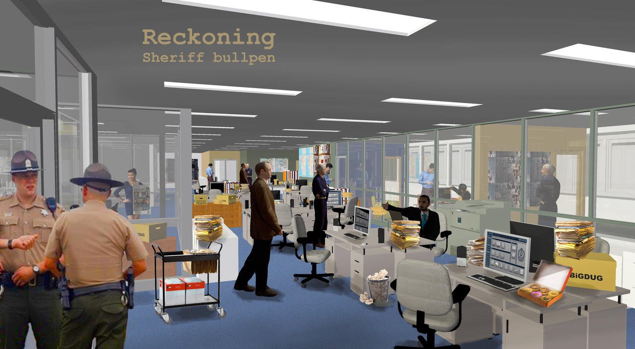
Initial discussions with the writers and the producers set the tone of the show. The darker elements were to be revealed bit by bit. To reinforce the horror of the crimes being committed, it was important to create a seemingly harmonious world. The burden of guilt that most of characters carry was a strong theme throughout the show. Reckoning is very much a character piece; therefore what is most important from a design perspective, is to reinforce the script by creating seemingly pleasant environments for them – their homes, the school and the police station.
As the production designer it is my role to create this world and tell the story through visual means. It was important to represent contemporary California accurately here and although it was a fictitious generic town, we took a lot of care through researching places such as Santa Cruz to build our world.
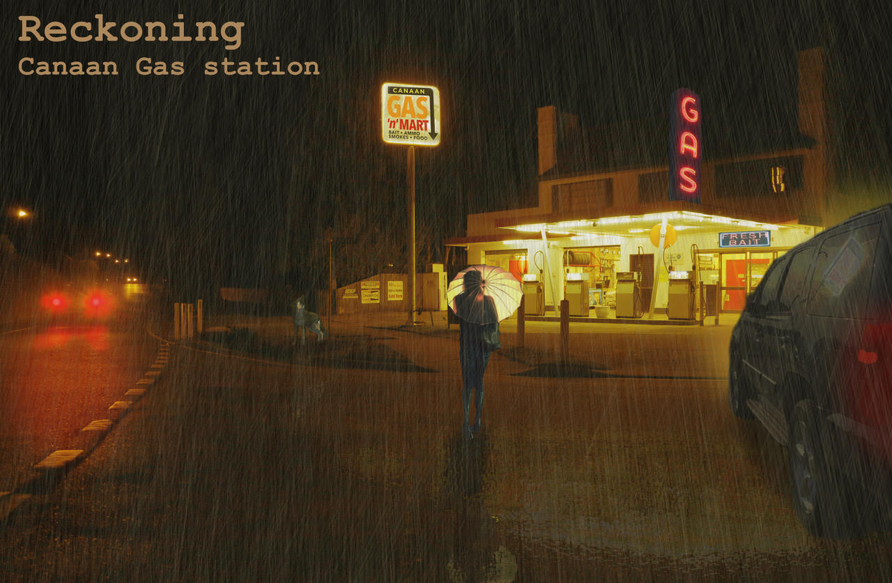
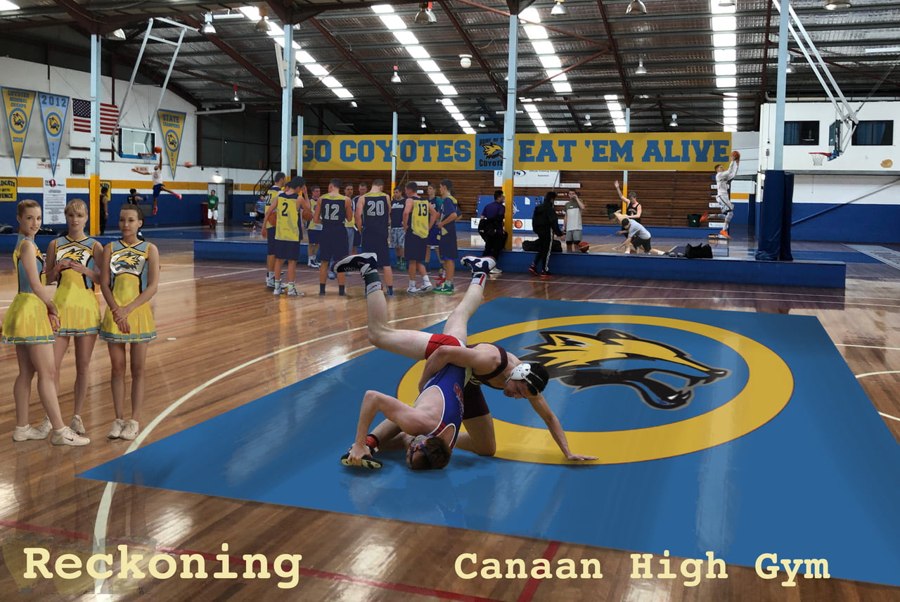
I started with several key script locations within the story to establish the world. The high school particularly, was one that the characters crossed over. Creating a typical US high school was very important in establishing the tone and character of the show. Colour choices are usually my starting point, to create the tone and feel of the world. It can reflect the season and the mood of the show immediately. In establishing the two main families, we settled on differing colour palettes to reflect their characters. We established several disparate themes that we kept returning to throughout the show – dogs, water, toads, rain, tattoo, neons and reflections.


When you receive the script what is the process you go through to get to the first day of filming?
Break down the scripts for locations, props, set builds, vehicles, livestock, graphics, special requirements, etc.
Discuss the tone style of the show with the writers, directors and producers before creating some colour and mood boards in relation to the scripts and collaborative discussions. Create some concept drawings. Specifically for Reckoning, were images that I created to get the tone right for the show. Then there is endless location scouting where aesthetic and practical issues are discussed. Quite frequently a location may be terrific from a design perspective but it may be too expensive or too distant to be utilised. Can be very frustrating!
Once a particular location is agreed upon then I usually do some more concepts to illustrate my vision for converting the site into the script location. They are discussed with the creatives (and the bean counters to see if we can afford the vision).
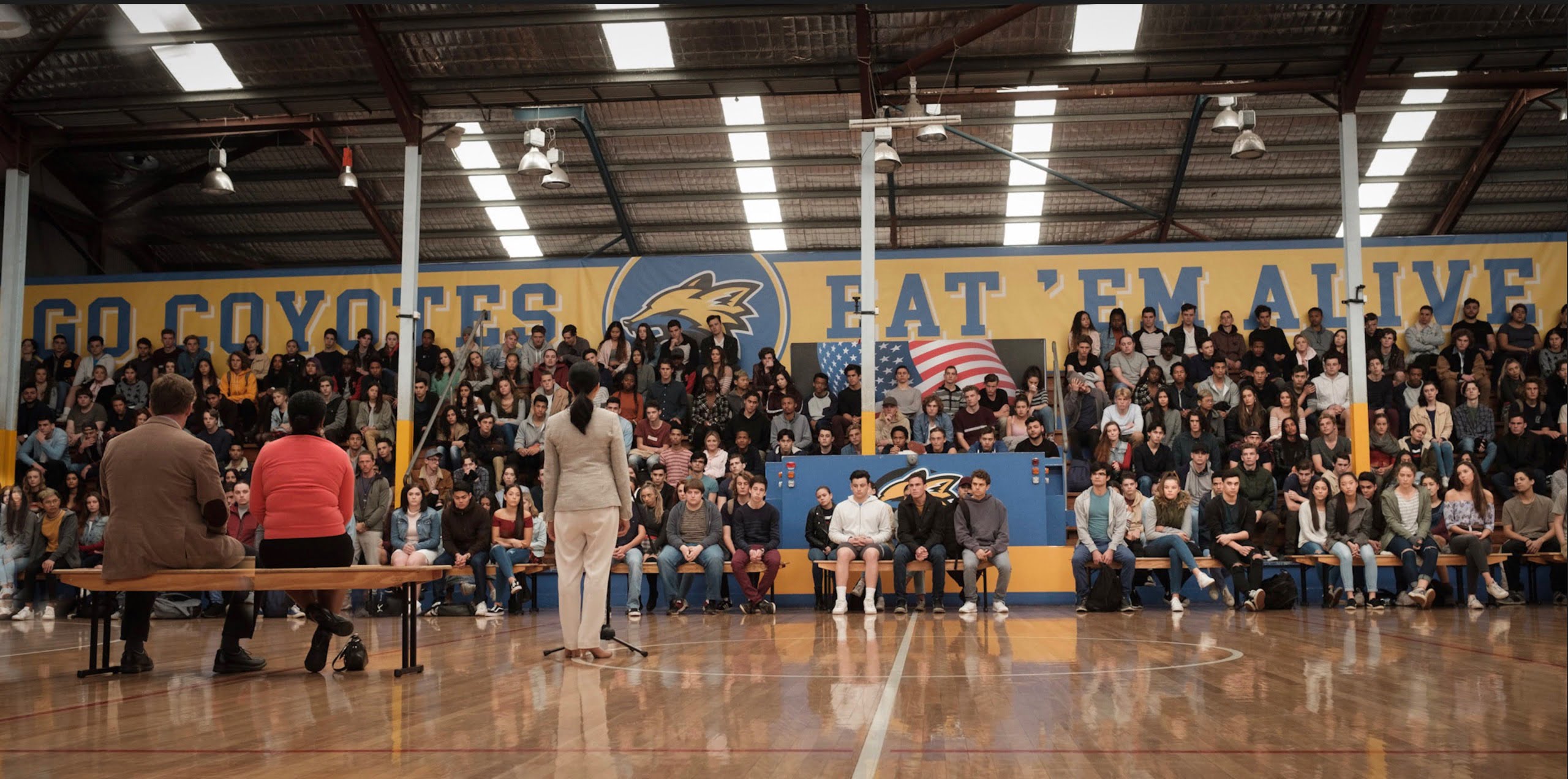
On Reckoning there was a great deal of graphics and signage to convert Sydney locations into California such as the several locations required to make up all the scripted elements of the hero high school.
Discussing the locations in depth with the set decoration team and deciding on style- decisions such as soft furnishings, furniture and dressing to create the parts of the world and how they intersect.
When the shoot starts we would go into a location a couple of days before usually and dress it for the shooting day. The hero houses were rented for the duration of the show, so we decorated them over a week or so. They both were completely painted and papered to realise our visions for the characters. Sydney houses are nearly always white inside – bland and boring – so it is important to introduce some colour and patterns to create interesting spaces for the characters to exist. The school was a palaver every time we shot it. We used the Physics faculty at Sydney Uni and it required redressing offices, corridors and signage several times over the shoot.


Who made up your team on “The Reckoning” and how did you work with them?
I broke down the script with Art Director, Nancy Dentice. We formulated a schedule of the process to realise the scripts. We budgeted expenditure for the different elements within the scripts. Set builds, set decoration expenditure, vehicles, special effects and crew logistics. Nancy maintains tyrannical vice-like control of all aspects of the art dept. and is in reality the boss. I certainly have to answer to her.
The Set Decorator was Brock Sykes with whom who I devise the colour palette alongside furniture and dressing choices. Including Nancy, the three of us, devise the whole look of the show.
Tom Coppola and Anna de Meyrick were the props buyer/dressers, tasked with finding the elements and realising the designs. Fantastic! The secret is to have collaborators with the same vision. I am very lucky with Nancy, Brock, Anna and Tom, as they are on the same ‘wave length’ as me creatively.
It is hard to quantify but it is important to have a team who are not conservative and are prepared to take a punt with an idea. No ‘world’ is created by one hand. Successful designing for the screen requires different perspectives and angles. I expect creative input from all the team to forge rich, layered and varied story worlds.
Jo Whincop was our amazing props mistress. She was in charge of all the hero hand props and the weird and wonderful stuff that we thought up. On crime thrillers this role is a very onerous. It requires a very committed person to do the research and realise all of the minutiae of the scripts. Often a lot of hero props are fundamental to telling the story; a piece of evidence, a particular photo, for example.
Adam Pinnock was our Vehicle Wrangler. Sourcing and providing a fleet of contemporary left hand drive cars in Sydney is a surprisingly big job on a straightforward project. There is a very tiny pool of suitable cars because of draconian roadworthy laws and vehicle rules and parameters in NSW.
Craig Mandile looked after the graphics for the show – another under-appreciated role. We were collaborating on a daily basis regarding signage, correspondence, labelling, screen graphics such as phones and social media, etc. To establish California and to placate copyright issues, everything had to be created including signage, websites, newspaper cuttings, hero photos, and vehicle numberplates. It was a very diverse series of graphic requirements. Craig had the terrific Emily Lam to assist.
Kylie Mather was our coordinator who organised the daily running of the office and mediated between Nancy and I when we argued. Our standbys were Moxy and Shane Rahkola who were the art department on set. Moxy is extremely experienced having worked on Star Wars and many Bazmark projects. We have worked together on and off for 25 years and it is great to have someone on set in whom you can completely trust their judgement and taste.
We didn’t have a lot of construction but Wolter Bron looked after that. Again I have worked with him for years and we have a shorthand in terms of builds. He knows what I want and I can trust implicitly to get the job done on schedule.
Marc Dwyer was our runner. Occasionally when a day got to too busy we would call in some extra hands as Series TV is always super fast and there is no place for passengers on the team.
What were the biggest challenges on this project?
Locations and vehicles. Finding suitable locations was the biggest issue. Although Sydney is a good match in terms of light and weather for southern California, there are only limited pockets of suburban architecture that are a good match for the US. The typical Sydney tile roof does not exist in the US. And although eucalypts are now common in California they are not to the extent of leafy suburban environments here. Finding the school was tricky too and in the end it required several different locations to make up the school. Peter Lawless and Singo did a great job. Shows like this can sometimes require 2 to 3 location found fro every day.Contemporary American left-hand drive vehicles are particularly difficult to source in NSW because of bizarrely strict registration laws. We had to import six vehicles from LA including the two hero pickups – at considerable expense.

How do you communicate your ideas throughout the process, from concept through to as you are filming?
There are a few ways I use to disseminate ideas. On Reckoning I was creating Photoshop renderings of the locations to communicate my ideas re colour, lighting, shape, dressings. Sometimes I will build a location or set in 3D via Vectorworks. These can provide animated walkthroughs and examples of camera angles and lenses for discussion with all and sundry.
We make mood and colour boards – again to set the feel and tone of the show and there will be reference boards with furniture and dressing examples made to work things out.
What does your art department office look like during the project?
Shambolic usually, a bit like my mind. It is a mess of images all over the walls and desks. Stuff all over the floor-drawings, fabric samples, furniture options, inspirational reference and options for props like lamps, taxidermy, neons, etc. There always was a lot of chocolate and biscuit residue for some reason. Whiteboard with the ever-changing shooting schedule for everyone to reference.
My own office is a pigsty – I find the best place to file things is on the floor. When someone comes in and enquires about a particular set or location it is there, all laid out.
For me, it means that everything is at hand to compare and appreciate a complete and holistic approach to the show. The art department on any show is not accounting. It is immersion in the world – whether it is a 19th convict drama or a contemporary rom-com. The art department crew do long hours -their working environment must be both stimulating and relaxed. Some days the office is full of dressing and props- great! THAT is immersion.
It drove our art director Nancy mad!!